Thursday, February 21, 2013

dining out: dc-3

When my parents came to visit earlier this month, they got in around dinnertime Friday. They'd been in the car for six hours, so we decided to get dinner somewhere quick and casual. I suggested DC-3, the hot dog place on Barracks Row, and they loved it.

The restaurant's name and decor are based on 1940s commercial air travel. Airplanes made traveling across the country easier, and the restaurant links all of those cities via their hot dogs. Like a New York coney dog or a Cincinnati chili dog.


Tony, always the adventurous eater, ordered the bulgogi and kimchi dog. Couldn't stop raving about it, particularly the buttered roll.


And the man ordered fried pickles. He and my dad devoured them.


This place is vegetarian-friendly. I ordered a veggie dog with veggie chili. (And a random pickle just because.) Really happy with it. I've had the falafel dog on a previous trip - also tasty.


We were there right before Lent started, so my dad ordered a Mardi Gras-themed dog.


And my mom went with the Cincinnati coney dog, easy on the onions.


DC-3 is a crowd pleaser, and a good dining option if you're looking for food quickly.

Wednesday, February 20, 2013

home improvement: drafty outlets

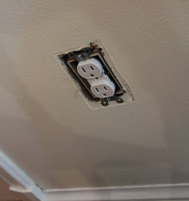
When my parents were in D.C. earlier this month to help put up crown molding, my dad mentioned that he felt a draft from our outlets and that we might want to insulate them. It had not occurred to me that (a) outlets can be drafty or that (b) they can be insulated. But now I know.

So the next time Tony and I were at Home Depot, we picked up a couple of packages of these outlet sealers. We used one piece for each light switch and outlet on the front and back walls of the house. (Rowhouse living perk - no need to insulate on the sides of the house because they're up against the neighbors' houses.)


The process started with removing the outlet covers.


Here's one of our drafty outlets:


The material on the insulation is perforated, so you just have to poke through the shapes to fit the light switch or outlet.


Like so:


Here's Tony placing the foam over the outlet.


And that's about it. Screw the outlet cover back on. The capital investment for this project was about $4 for two packages of insulation, so hopefully we recoup that cash in the form of lower utility bills over time. No more drafty outlets.

Tuesday, February 19, 2013

decor: orange ikea lamp

A couple of months ago, I pinned a photo of a white metal cabinet from Ikea, which I thought could fit perfectly by the front door and would solve all of my shoe storage/umbrella storage/magazine storage/paper shredder storage problems. I'm 29 years old, so I've reached the point of my life where I'm trying to downsize my Ikea furniture, not add more, but I've been searching for months for a piece of furniture that would fit in that space, to no avail. So on Saturday morning, I finally decided to pull the trigger on the Ikea cabinet, and Tony and I got in the car and made our way to College Park.

Only ... we got there and found out the white cabinet has been discontinued. Extreme disappointment ensued. (They still sell red, though.)

But you can never leave Ikea empty-handed, can you? The geniuses behind the Ikea shopping experience force you to walk through all of their displays, and you can never resist picking up something you love. Like this glass lamp. They got me. I bought it. I'm a sucker. (It was $13 for the lamp + $6 for two bulbs.)


I have it parked on the trunk under the stairs, next to my elephant planter.


The colors in my living room are teal and orange, although I've been thinking I need more pops of orange to make the color scheme more obvious. The shape of the lamp is also very modern, which I like to contrast with all of the antique pieces I have. Plus, this little lamp gives off a nice warm glow in the living room in the evenings.


So, our Ikea trip summarized: one major decor disappointment and one minor decor success. Now I'm stalking Craigslist looking for the Ikea cabinet. Maybe someone in the D.C. metro area is approaching 30, looking to upgrade their furniture, and selling their Ikea stuff online. Fingers crossed, y'all.

<3

In unrelated weekend news, my crocus bulbs started blooming yesterday. Looks like my medicated foot powder technique worked in keeping the squirrels away so far. Spring can't be too far away.

Thursday, February 14, 2013

things to do: eden center

Last Sunday, Mike and Jen needed to stock their pantry with some Asian foods, so we all trekked out to do some shopping at Eden Center near Seven Corners, which has dozens of Asian grocery stores, restaurants and shops -- all in a compact shopping plaza. This place is incredible and overwhelming at the same time, especially because we happened to arrive during the Chinese New Year celebration.

We picked up some pantry goods like rice noodles at the main grocery store. Tony bought some boiled peanuts at another store. We watched the New Year's dances in the parking lot - and then tried to avoid the firecrackers and their plumes of smoke.


And then we stopped for lunch. Choosing a restaurant in Eden Center is particularly overwhelming. There are so many - how do you pick? We ended up going with Rice Paper, a Vietnamese restaurant, which was full of customers, so we figured that was a good sign that the food was good. And it definitely was.

I ordered a fried tofu and vegetable dish, which had a wonderful flavor.


Everyone else ordered pho, and they all said it was delicious.


We tried to leave after lunch, but the parking lot was a nightmare with the New Year's festivities. Mike's car was blocked in the spot by THREE other cars. So we crossed a couple of pretty busy streets on foot (Seven Corners is not pedestrian friendly) to kill some time at Home Depot, where we picked up some things for the house, including insulation pads for outlets. (More on that later.) And by the time we were done at Home Depot, the parking lot had cleared out and we were able to make our way back to the city.

So if you're in the mood for some good Vietnamese food and Asian grocery shopping and you find yourselves near Seven Corners and you are in the mood to brave crazy traffic -- check out Eden Center.

Monday, February 11, 2013

home improvement: crown molding

It was a big home improvement weekend in our house, guys. Crown molding went up downstairs!


The project is 90 percent finished -- all we need to do is paint it. But I couldn't wait to write about this project.

I knew that the house would look better with crown molding, but I didn't realize how much better until it was on the walls. The room looks tied together and finished, and I love it so, so much.

My dad has put up crown molding in pretty much every room in his house, so he's an expert, and he said he'd come down to help with the project. The thing about putting up crown molding is that the molding and supplies aren't that expensive -- we paid less than $100 for all of the materials -- but the labor can be the expensive part. So we're lucky to have an expert in the family who was willing to help us out.

When Tony and I were in Ohio for Christmas, I went to the local hardware store with my dad, and I picked out the molding I wanted. Our ceilings are 9 feet downstairs, so I wanted large molding. I went with the 5 1/4-inch size. I decided against solid wood and went with MDF particleboard. MDF is straighter than solid wood and easier to work with. You need solid wood for baseboards and other trim that could get banged up, but nothing is going to damage molding on the ceiling.

Here's a shot from Saturday morning, as the pieces started to go up!


Tony and my dad used a nail gun with an air compressor to attach the molding. A row of nails in the drywall and a row of nails in the ceiling.

(Victor, by the way, was not impressed with the presence of the air compressor. It would rev up randomly and loudly, which means Victor spent much of Saturday under our bed. Here he is on Sunday afternoon, still looking unimpressed with the whole project, haha.)


(And here he is sitting on the spiral staircase, keeping an eye on Tony as he does some finishing touches - wiping down the spackling. The cat loves this staircase, by the way. He gets a birdseye view of the entire house. Also, when he's laying on the steps, he refuses to move out of the way for a person walking up the steps. It's kind of funny.)


Anyway, enough about the cat. Here's a picture of Tony being manly with the compound miter saw.


Here's an in-progress shot. You can see the slight variances in the ceiling height. Ceilings in houses (especially old houses) aren't exactly even. See the shadow between the molding and the ceiling where the molding doesn't quite reach the ceiling?


At this point, my mom and I left to go shopping. Because putting up crown molding is really a two-man job, and there were two extra people in the small space.

So I'm not sure what Tony and my dad did over the next few hours, but this is what our patio table looked like when my mom and I came back Saturday afternoon:


And this is how the inside of the house was looking:


Here's a before photo:


The gap between the ceiling and the molding disappeared. My dad used a tube of caulking to fill in those gaps.


And Tony filled all of the nail holes with lightweight spackling.


Here's a before shot of part of the room:


And some after pictures:


Before:


After:


And as a bonus, there was just enough molding left over to put it up in the half bath downstairs. So now the entire first floor is done. Which leaves us with just two bedrooms, the full bath and the upstairs hallway that are un-crown molded. Maybe down the line.


Oh and here's what one of the walls in the bathroom looks like right now. Someone is planning a makeover! I'm leaning toward the grays ... but that's a project for another day.

Thursday, February 7, 2013

decor: a space to live in

Over the holidays, I read this blog post about holiday entertaining and how to make your house appear cleaner than it is. Tip No. 4 is to hide all of your dirty dishes in the oven before your guests arrive.

How dumb. I love reading decor and design blogs, but the oven recommendation epitomizes what's wrong with them. This writer wants her house to look perfect for her guests -- but the thing is, homes are not perfect. Homes that real people live in will never attain perfection. We are not Martha Stewart. We don't live in museums. We live in houses. Houses that sometimes get dusty, that sometimes need laundry put away, that sometimes have dishes in the sink.

Presumably, the blogger dirtied several pots and pans while cooking dinner for her friends. Most likely a handful of utensils, perhaps a plate or two. Maybe a mixing bowl. Some measuring cups and spoons. I understand the feeling of wanting your house to look its best when guests come over, but the people who are coming to your house for dinner surely know that meals do not get made by magic and that dirty dishes are involved. So put those dirty dishes in the sink. Dirty dishes belong in the sink. If you have time, wash the dishes before your friends arrive. And if you run out of time, leave them in the damn sink.

And that brings me to my second rant of the day.

I see this all the time on blogs: a bookshelf in someone's home where all of the book jackets are green or purple or whatever to coordinate with the room's color scheme. Or where all of the books on a shelf are the same size. Or where the books are arranged by color to look like the American flag?

And that's ridiculous. Nobody's real-world house will ever look as interesting as those pictures because organizing books by color or size makes no sense -- how are you going to ever find a book that way? In the real world, books are alphabetized by author. I submit that a truly talented interior designer would be able to organize books alphabetically, based on how they're actually used, and still make a room look interesting. Form should follow function.

End rants.

Wednesday, February 6, 2013

dining out: bgr

Last Friday after work, Tony and I didn't have plans, so instead of going straight home, we decided to stop for dinner. I had heard good things about the veggie burger at BGR, so we made our way to the location in Old Town.

In so many restaurants, the veggie options are either (a) nonexistent or (b) an afterthought. BGR is different. You can tell that some chef somewhere spent a lot of hours trying a lot of different recipes to perfect a veggie burger that doesn't fall apart and has a unique sweet flavor. I read later that the company founder's wife is a vegetarian, and then it all made sense. A man who is in love with a vegetarian, who dines out with said vegetarian, who is keenly aware of the pitfalls of vegetarian options on restaurant menus -- that man is going to make sure his own restaurant prioritizes the veggie burger.


So, the food was great. Tony ordered the ahi tuna burger, which he really enjoyed. He also raved about his parmesan-garlic French fries, but that's when things started to go south. His fries were tossed with the cheese and about a dozen roasted garlic cloves. So the cloves were on his plate, and he thought, hey, eating a dozen garlic cloves is probably a good idea. Said garlic cloves can be spotted in the photo below:


Folks, if you order the garlic fries at BGR, please, for the love of all that is good, do not also eat the cloves. Leave the cloves on the plate. There is no rule that says you must eat all of the food on your plate. Tony had garlic pouring out of his skin for 48 hours. Before Camille and Matt came over for dinner Saturday night, Tony put on several layers of clothing and went for a long run to sweat some of it out, then he took a hot shower to flush more of it out, all while drinking copious amounts of water.

Now, the cost. The meal cost about $36, which I'd say is about double what seems appropriate for the ambience and the fact you order at a counter. Would I go back? Maybe. I don't think it's a place I'd ever suggest that we go, but if someone we're hanging out with is ever in the mood to go to BGR, we'd go along. Or maybe I'd go back if I'm around a BGR for its lunch special (burger + fries + drink for $8.99).

BGR is a locally based chain that seems to be expanding rapidly.

Tuesday, February 5, 2013

recipe: blondies

You know the final scene in The Good, the Bad and the Ugly when the Ugly yells, "Hey, Blooondieeeeee!!!!" as Clint Eastwood rides off on his horse? For the two days that these blondies were in my house, every time I looked at one, my internal dialogue yelled, "Blooondieeeeee!!!!"


This is another recipe from the good folks at the America's Test Kitchen empire. Last weekend I renewed the Cook's Illustrated cookbook that I had checked out from the library, and I tried another dessert recipe from the book.

I made blondies -- they're shaped like brownies, but the brown sugar gives them the flavor of a chocolate chip cookie. I picked this recipe because I didn't have a lot of motivation for baking Saturday, and this was a straight-forward recipe. (That can't be said for all ATK recipes ... sometimes they get complicated.)

I served some of these guys Saturday night for dessert when Camille and Matt came over for dinner, and I brought the rest to Ben and Mandy's house for the Super Bowl. And if I may be cliche, these guys scored a touchdown! At least the cookies won, even if the 49ers didn't.


Blondies
Via Cook's Illustrated Cookbook

  • 1 1/2 cups flour
  • 1 teaspoon baking powder
  • 1/2 teaspoon salt
  • 1 1/2 cups light brown sugar
  • 12 tablespoons butter, melted and cooled
  • 2 eggs
  • 1 1/2 teaspoons vanilla
  • 1 cup walnuts (or pecans), toasted and chopped coarse
  • 1/2 cup semisweet chocolate chips
  • 1/2 cup white chocolate chips

Mix flour, baking powder and salt in a medium owl.

In a large bowl, whisk brown sugar and butter. Whisk in eggs and vanilla.

Fold dry ingredients into wet ingredients until just combined. Be careful not to overmix.

Fold in nuts and chocolate chips.

Grease and flour a 9-by-13-inch pan. (Original recipe wants you to make a "foil sling," but that's never worked out for me.)

Scrape batter into prepared pan.

Bake at 350 degrees for 25 minutes. Top will be shiny and starting to firm up when it's done. Let cool completely in the pan on a wire rack.

Monday, February 4, 2013

decor: above the table

For a long time, the wall behind our dining room table had been blank because I couldn't find any one piece of art that was big enough to fill the space. I thought maybe I'd run across one of those old pull-down maps of the United States or the world from schools, which would be the perfect size. No map has been found, however. (Except for the one that my parents have hanging up in their basement, but don't even bother asking to have it, guys. I've tried. They won't give it up.)

So a few months ago, I got out my Rubbermaid bins of miscellaneous smaller art and frames, and I started brainstorming what would go together. Then I got out a hammer and nails and got to work.

And I wasn't completely happy with it at first, but I lived with it for a couple of months to see if it would grow on me. And it eventually dawned on me that everything was hanging about six inches too high. So I recently got out the hammer and nails again (and some spackling to fill the old holes), and I moved the whole shebang down about half a foot. Much better. I'm really happy with how the collage turned out.


Here it is a little closer:


The pink birds in cages on the lower right and the tree trunks on the far left are wallpaper samples from Anthropologie. 


The mirror was cheap at an auction. Here's how I found it:


And here's how it looks after a couple of coats of white paint:


I bought the bird painting for Tony as a wedding present. It's from the Art League's gallery at the Torpedo Factory in Old Town.


I thought Tony and I could make a tradition out of it and every year for our anniversary, instead of buying gifts for each other, we could buy a piece of grown-up art for the house. Our first anniversary coincided with moving into our house, so we were overwhelmed, and it didn't pan out the first year. And then the second year, things kind of got away from us. So maybe we can finally get that tradition started this year...

Anyway, I'm really happy with how the art turned out above the dining room table. Here's how that part of the dining room looks now with the white dresser and typewriter: